In this project, I worked as a UX researcher and a Ux designer during the ideation and implementation phase.

The product: FITforALL is a fitness coaching app for people with limited motor function. It cares about the customers who are having limited motor skills where they can check exercise videos and book live exercise sessions on puchase according to their medical condition on the app with customised needs and necessities.
Challenge: People with limited mobility has a difficulty to go to clinic everyday for exercise due to their condition and unavailability of helper, driver. They also need customised food plan according to their medical condition, expert advise and lab tests at the same time.
Solution: FITforALL ensures that users complete the core tasks of the session booking app on their convinience and as per the schedule designed by their expert according to their illness.
Responsibilities: Doing surveys on a focused group of disabled people and interviews to caretakers/ family members, paper and digital wireframing, low and high-fidelity prototyping, conducting usability studies, accounting for accessibility, and iterating on designs.
Duration:
December 2021 to January 2022
Research
RESEARCH GOALS
Who, why, where and what people search for exercise when they are injured or disabled?
The specific challenges that users might face in the booking the session that suits their choice and finding the other services like diet and talk to experts on the app
if the main user experience, searching for the particular disability, videos/live sessions that suits their condition, and their performance records with new customised features, are effective and easy for users to complete.
RESEARCH METHODOLOGIES
As a UX Researcher, I used different research methodologies to collect data in order to answer our research goals. (Unmoderated study)
Location: Australia, India, remote (each participant will complete the study in their own home)
Length: Each session lasted 5 to 10 minutes, based on a list of prompts
PERSONAS AND UNDERSTANDING THE USER
User story: Mahesh
As a working professional living outside my home town.
I want to Have something that helps my old age grand parents in their exercise routine.
So that I can help them in their exercise routine.

User story: Ruby
As a working professional who has a limited time in a day at home.
I want to have an app/web where I can find exercise routine for my mother who has having limited movement .
So that she can do exercise on her own.

User Jouney Map:

USER RESEARCH PAIN POINTS
Due to busy life users need platform that takes care of the patient's regular exercise prescribed by doctors at home while they are on a workplace.
Users who are away from the house, they need online exercise assistance for their parents at home.
People having disability or injuries, do not prefer to visit the clinics everyday. They sometimes may need online sessions with the doctors and physiotherapists.
Busy life
Assistance at home
Difficulty in visiting the clinic physically
Design, Test, Iterate
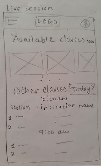
PAPER WIREFRAMES: Taking the time to draft iterations of each screen of the app on paper ensured that the elements that made it to digital wireframes would be well-suited to address user pain points.

.jpeg)
.jpeg)
DIGITAL WIREFRAMES: As the initial design phase continued, I made sure to base screen designs on feedback and findings from the user research.
This part allows user to book a session

This part allows user to check the packages
LOW FIDELTY PROTOTYPES: Using the completed set of digital wireframes, I created a low-fidelity prototype. The primary user flow I connected was booking an event, checking for date availibility, offers, and other important details of the restaurant, so the prototype could be used in a usability study.

MID-FI USER TESTING:
Research Questions
05
Are there more features that users would like to see included in the app?
07
Is the payment process easy for the customer?
06
Do users think the app is easy or difficult to use?
01
How long does it take for a user to find disability type and book a session in the app?
03
Are there any parts of the live session booking/video searching process where users are getting stuck?
02
Are users able to successfully book the session that they want?
04
What can we learn from the user flow, or the steps that users take, to sign up/ payment and booking the session?
Key Performance Indicators (KPIs)
01
Time on task: how much time users spend sign up and buying the package?
03
Conversion rates: how many customers are booking?
02
How much time users spend searching for desired exercise and booking the session?
04
User error rates: how often users get stuck trying to buy package/book the session they want?
Jamboard

USABILITY STUDY : FINDINGS
Insight Identification Template
-
Based on the theme that: Homepage needs to be more sorted or organised, an insight is: buttons has to be togather.
-
Based on the theme that: More options for fitness has to be there, an insight is: Few more desired features like expert advice, dietitian should be there.
-
Based on the theme that: It is favourable to see packages and book on the main page, an insight is: To keep packages and book session on the main page
Prioritized Insights Template
Priority 0 Based on the theme that: Homepage needs to be more sorted or organised, an insight is: buttons has to be togather.
Priority 1 Based on the theme that: It is favourable to see packages and book on the main page, an insight is: To keep packages and book session on the main page.
Priority 2 Based on the theme that: More options for fitness has to be there, an insight is: Few more desired features like expert advice, dietitian should be there
REFINING THE DESIGNS
MOCKUPS
The first usability study revealed frustration with extra options need to be there like medical advise, dietitian and lab test which are added in a footer menu.
Before usability study

After usability study

Early designs allowed for some customization, but after the usability studies, I sorted and managed homepage well that looks more convinient.
Before usability study 2

After usability study 2


HIGH- FIDELITY PROTOTYPE
The final high-fidelity prototype presented cleaner user flows for book sessions and check packages. It also met user needs for easy access to extra features.

Sitemap
Difficulty with navigation was the first pain point for the user so I used that knowledge to create a sitemap. My goal was to make systematic architecture to improve overall user experience on the app.

Responsive designs
The designs for screen size variation included mobile, tablet and desktop.


